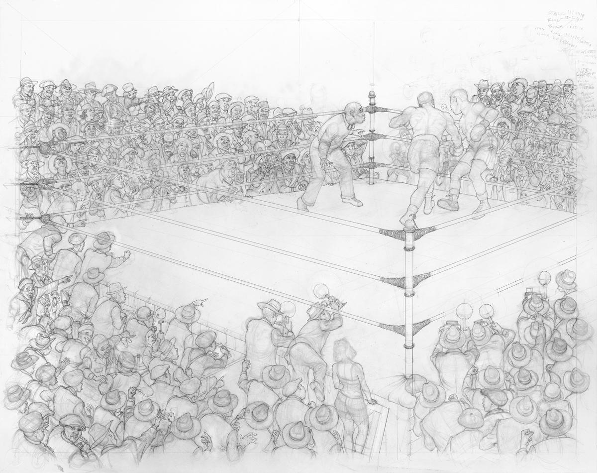
finished on my drawing desk.
I'll discuss in detail this 3rd and final installment, the inking process.
I've been working in pen and ink since since about the fifth or sixth grade. Crow Quill pen and nibs of various sizes dipped in a bottle of black India ink is how I got started.
These are the various pens and nibs I used (below left) and the mechanical pen I use now (right).
1964...
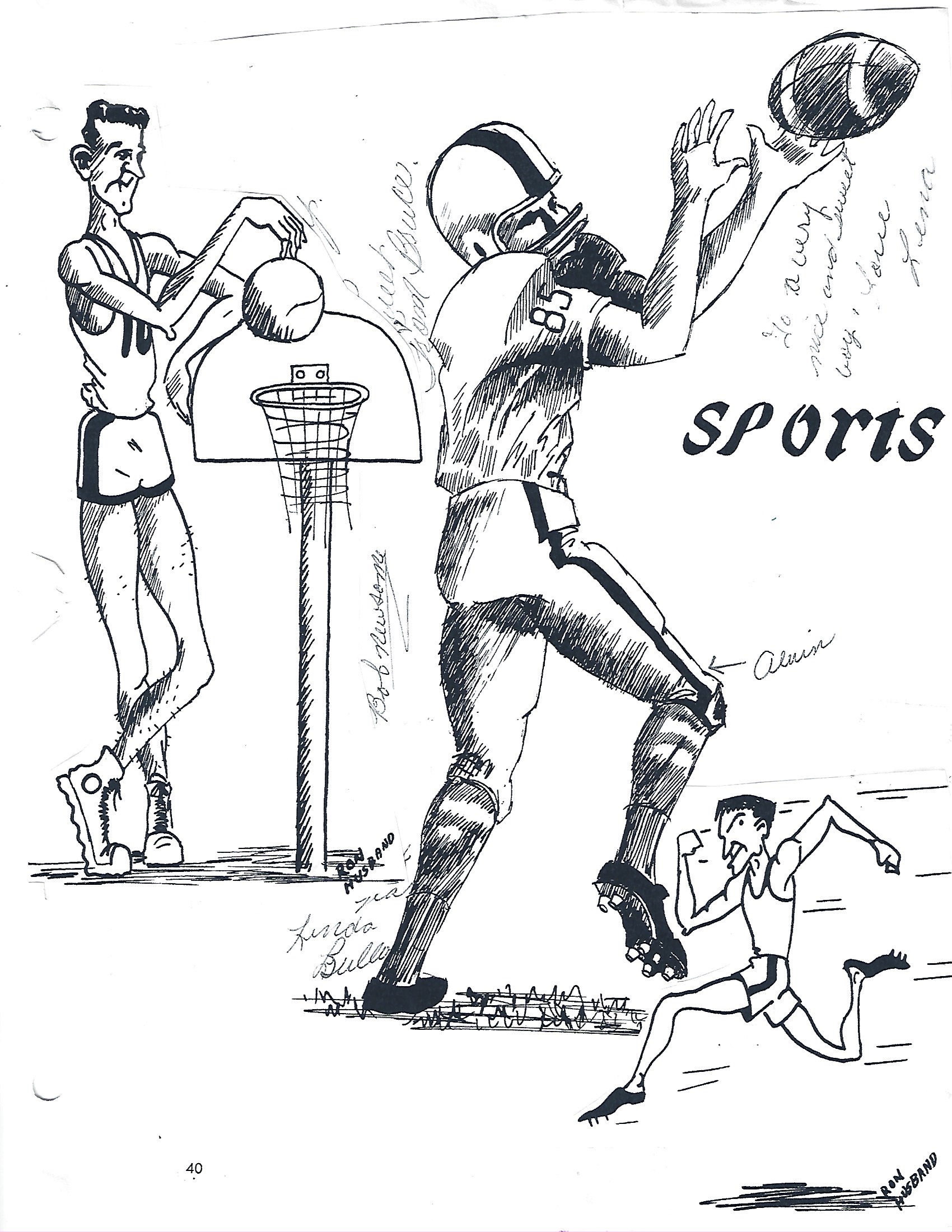
I was invited to contribute these drawings to my middle school year book. Here is what I drew for the Sports pages in Clifton Junior High (Monrovia, CA) annual (below).
1967...
Of the many techniques of pen and ink, cross hatching is what I gravitated to. One line at a time with the buildup of linework to create various gradations, textures and shadows. Ink straight out of the bottle to cover large areas works for comic and coloring books but for this type of inking it would produce an out of place 'hole' look (see black circle below right).
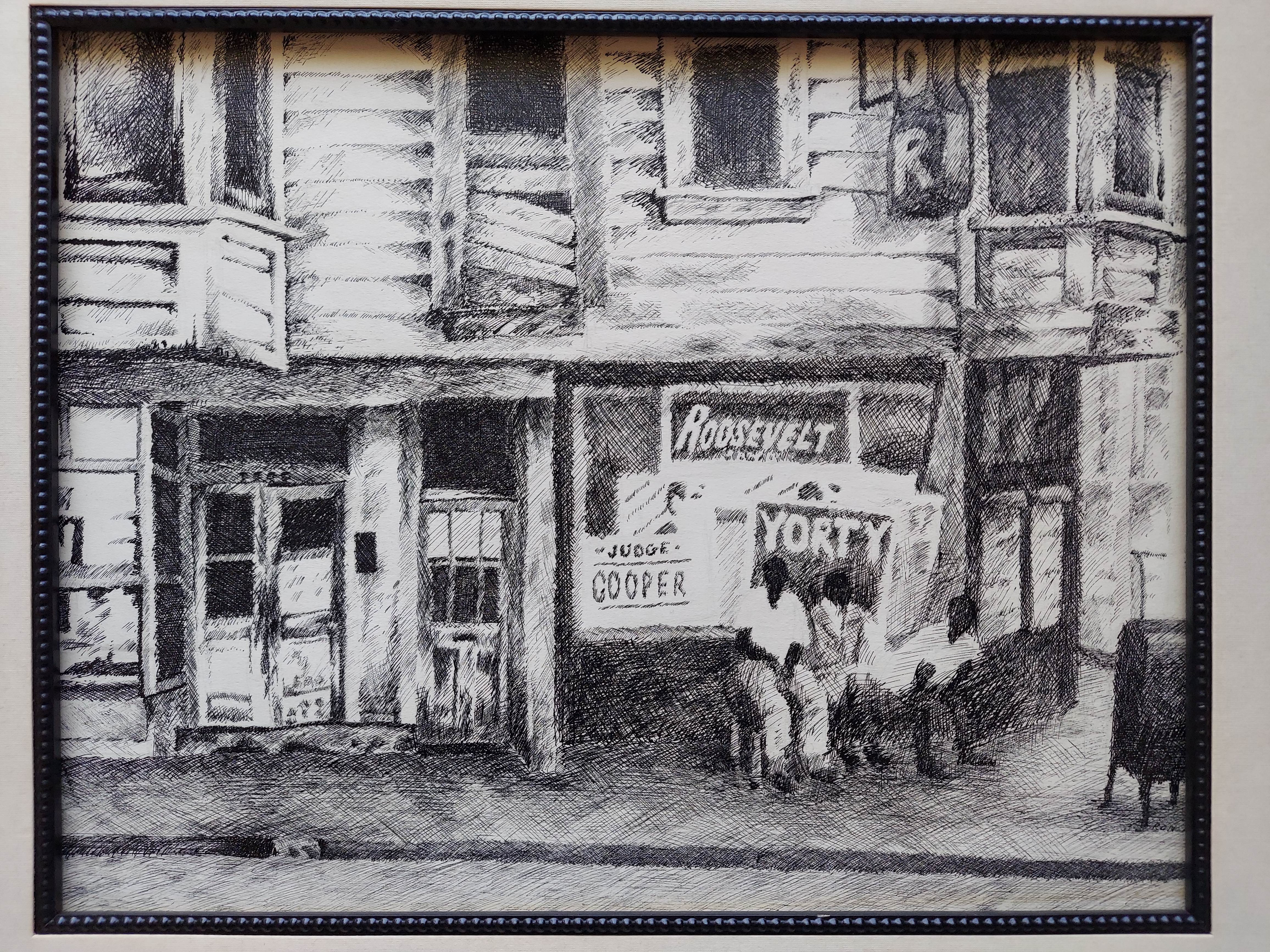
As a junior at Monrovia High (CA) this piece titled 'Skid row' won regional (Los Angeles) and national (New York) awards in pen and ink (below).
I inked with Quill pens until the early 1990's. The problems I encountered were that the nibs would wear from a sharp point to a rounded edge over the time it took to finish a piece (months to a year) and the dreaded ink splatter. My work was becoming more detailed, requiring finer line work. In order to pick up the lines I changed over from hand inked and pulled prints to giclee (French for spray or squirt, pronounced zhee-klay).
2/4/20...
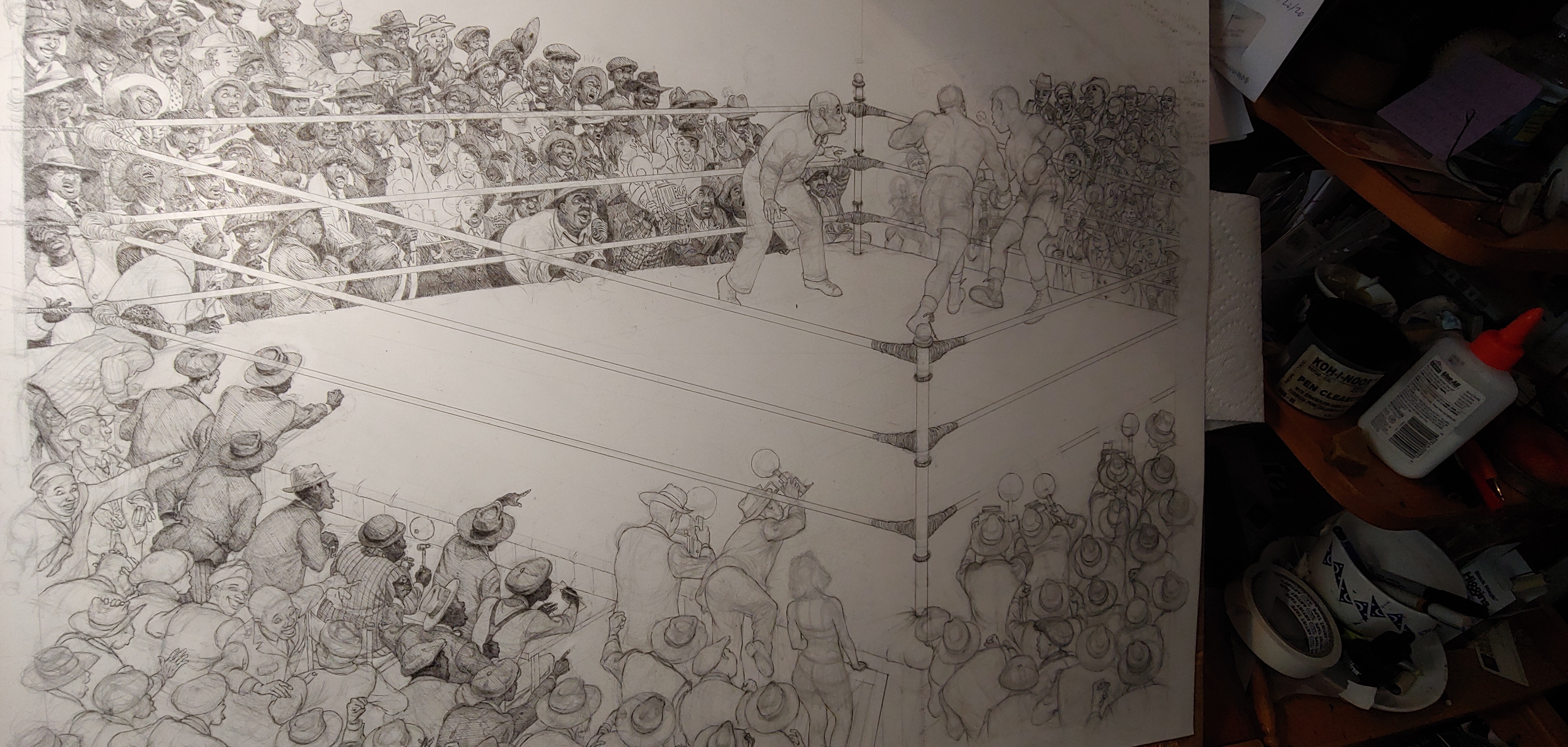
The first ink lines over pencil drawing (below) were the ring posts and lower right side hat wearers and photographers.
2/8/20...
Next, upper and lower left side got the ink treatment (below).
2/19/20...Added to the ink progression was the upper right corner.
The ink outline was finished about a month later on 3/2/2020... All images inked except for the ring card females hair.
Another trip to the printer to document this stage of the journey (below).
3/15/20...
Close up of upper left as cross hatching starts (below).
Far upper left, caricature of a friend Johnny McLaurin, is the first to receive the cross hatching treatment.
4/8/20...
Light and shadows start to bring out the forms of the people around the ring (below).
4/17/20...Lower left corner gets fleshed out with ink (right).
5/11/20...
Two major sections start to take form (below).
5/20/20...Lower right corner starts to take form with ink (below).
6/5/20...
Darkness brings out the overhead lighting that will help draw attention to the action in the ring (below).
Upper left and right corners bracket the action (below).
The most challenging four characters are saved for last.
Number four on the list is the referee (below).
Numbers two and three are the fighters. The first lines are started as I carve out their bodies.
From this C.U. you can see I had not started to soften the camera flashes at this point. That would come as I fine tuned the illustration towards the end of the inking process.
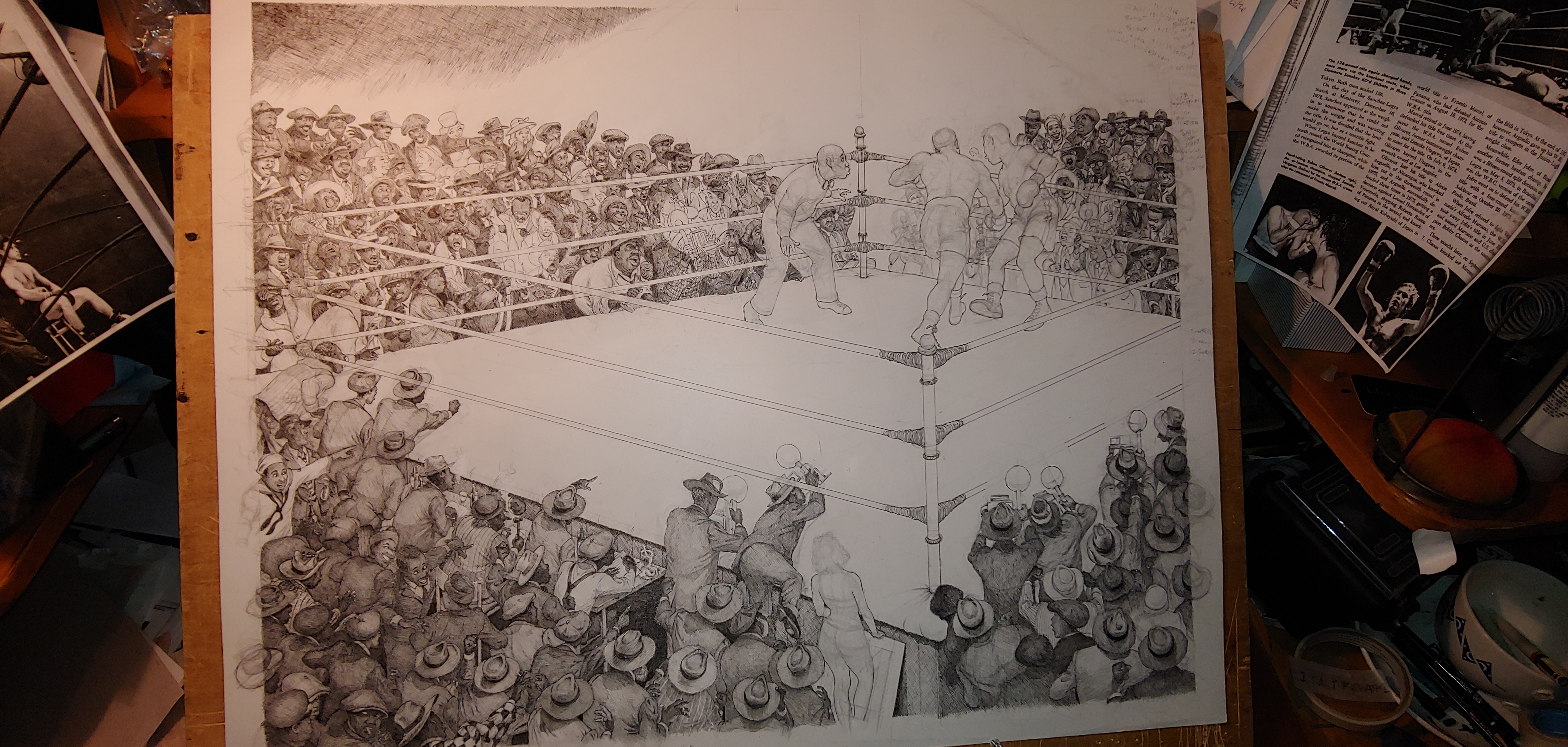
Being anatomically correct was a priority for the boxers (below). Physically, both are evenly matched. The rounds card informs us that we are witnessing the latter (14) rounds. The ropes of the ring get some ink as attention goes to how they reflect the flash of the cameras and the lights above.

The lady at the edge of the ring is last person to taste my ink. I realized she could be transformed from beauty to grotesque in the width of a line. From a three quarters rear view, her stature was carefully massaged from the end of my pen, . The rough and rowdy surrounding environment is contrasted with her feminine lines. Her hair was purposely left in pencil to this point to capture the more natural 'hot pressing comb' look that was popular at the time.
The canvas flooring is the final section to be inked.
Final thoughts...
This and my other pen and ink pieces are designed to function from a distance, mid-range and up close.
I have seen people with their nose to the glass eyeing every line. There are viewers standing at arms length taking in the whole, various emotions washing over their faces. From this span the viewer can scrutinize each face as it reacts to the punch and observe the universal lean towards the action. In case the viewer misses all that, there are numerous arms and cameras pointed in the direction of interest.
From a distance or squinting your eyes, the light above draws immediate attention to the main attraction, the boxers. The upper left corner grouping triangles to a point aimed at our fighters. The referees stance, which at first recoiled from the action, now bends forward leading the eye in the direction of his sight. Lower left corner triangle shape leads to the ring post up the boxer's leg, through his upper torso to the right arm delivering the punch. Lower right side triangular shape does the same. All in an attempt to get the eye to focus attention on the two in the ring.
(About Final thoughts...- It was always funny to me that my art history teachers, some five hundred or so years after the fact, were analyzing what the artist had in mind when he/she did this or that in their artwork. Maybe the instructors were correct in their assessment or maybe passing on an educated guess, if the artist did not say as much. My intentions you got "from the horse's mouth":- )
In all that is happening in this wall to wall action bonanza there are> 7 Wedding rings, 9 Women, 13 Smokers, 6 Bottles of beer, 12 Cameras, 12 Without hats, 4 Bowties, 2 Hotdogs, 4 Wearing eyeglasses, 4 Military, 1 Gun and about 160 people, I kept coming up with a different count so after four tries-
about).


This is fantastic Ron! Love all the details, energy and storytelling. Really beautiful! Thanks for sharing all the information about your process as well!
ReplyDelete