Tuesday, May 24, 2022

Knockout 1930 an inside look Part 3 Inking


1/18/21...11:00AM Knockout 1930 finished on my drawing desk.
I'll discuss in detail this 3rd and final installment, the inking process.

  I've been working in pen and ink since since about the fifth or sixth grade. Crow Quill pen and nibs of various sizes dipped in a bottle of black India ink is how I got started.

 These are the various pens and nibs I used (below left) and the mechanical pen I use now (right). 


1964...

I was invited to contribute these drawings to my middle school year book. Here is what I drew for the Sports pages in Clifton Junior High (Monrovia, CA) annual (below).


1967...

Of the many techniques of pen and ink, cross hatching is what I gravitated to. One line at a time with the buildup of linework to create various gradations, textures and shadows. Ink straight out of the bottle to cover large areas works for comic and coloring books but for this type of inking it would produce an out of place 'hole' look (see black circle below right).


 As a junior at Monrovia High (CA) this piece titled 'Skid row' won regional (Los Angeles) and national (New York) awards in pen and ink (below).


 I inked with Quill pens until the early 1990's. The problems I encountered were that the nibs would wear from a sharp point to a rounded edge over the time it took to finish a piece (months to a year) and the dreaded ink splatter. My work was becoming more detailed, requiring finer line work. In order to pick up the lines I changed over from hand inked and pulled prints to giclee (French for spray or squirt, pronounced zhee-klay).

2/4/20...

The first ink lines over pencil drawing (below) were the ring posts and lower right side hat wearers and photographers.


2/8/20...

Next, upper and lower left side got the ink treatment (below).


2/19/20...
Added to the ink progression was the upper right corner.


 The ink outline was finished about a month later on 3/2/2020...
 All images inked except for the ring card females hair. 
Another trip to the printer to document this stage of the journey (below).

3/15/20...
Close up of upper left as cross hatching starts (below).
 Far upper left, caricature of a friend Johnny McLaurin, is the first to receive the cross hatching treatment.


4/8/20...
Light and shadows start to bring out the forms of the people around the ring (below).


4/17/20...
Lower left corner gets fleshed out with ink (right).

5/11/20...

Two major sections start to take form (below). 


5/20/20...
Lower right corner starts to take form with ink (below).


6/5/20...
Darkness brings out the overhead lighting that will help draw attention to the action in the ring (below). 

Upper left and right corners bracket the action (below).


 The most challenging four characters are saved for last.
 Number four on the list is the referee (below).
 Numbers two and three are the fighters. The first lines are started as I carve out their bodies. 
From this C.U. you can see I had not started to soften the camera flashes at this point. That would come as I fine tuned the illustration towards the end of the inking process.

 Being anatomically correct was a priority for the boxers (below). Physically, both are evenly matched. The rounds card informs us that we are witnessing the latter (14) rounds. The ropes of the ring get some ink as attention goes to how they reflect the flash of the cameras and the lights above.
 The lady at the edge of the ring is last person to taste my ink. I realized she could be transformed from beauty to grotesque in the width of a line. From a three quarters rear view, her stature was carefully  massaged from the end of my pen, . The rough and rowdy surrounding environment is contrasted with her feminine lines.  Her hair was purposely left in pencil to this point to capture the more natural 'hot pressing comb' look that was popular at the time.
 The canvas flooring is the final section to be inked. 

 Final thoughts...
This and my other pen and ink pieces are designed to function from a distance, mid-range and up close.
I have seen people with their nose to the glass eyeing every line. There are viewers standing at arms length taking in the whole, various emotions washing over their faces. From this span the viewer can scrutinize each face as it reacts to the punch and observe the universal lean towards the action. In case the viewer misses all that, there are numerous arms and cameras pointed in the direction of interest. 
  From a distance or squinting your eyes, the light above draws immediate attention to the main attraction, the boxers. The upper left corner grouping triangles to a point aimed at our fighters. The referees stance, which at first recoiled from the action, now bends forward leading the eye in the direction of his sight. Lower left corner triangle shape leads to the ring post up the boxer's leg, through his upper torso to the right arm delivering the punch. Lower right side triangular shape does the same. All in an attempt to get the eye to focus attention on the two in the ring.
(About Final thoughts...- It was always funny to me that my art history teachers, some five hundred or so years after the fact, were analyzing what the artist had in mind when he/she did this or that in their artwork. Maybe the instructors were correct in their assessment or maybe passing on an educated guess, if the artist did not say as much. My intentions you got "from the horse's mouth":- )

In all that is happening in this wall to wall action bonanza there are> 7 Wedding rings, 9 Women, 13 Smokers, 6 Bottles of beer, 12 Cameras, 12 Without hats, 4 Bowties, 2 Hotdogs, 4 Wearing eyeglasses, 4 Military, 1 Gun and about 160 people, I kept coming up with a different count so after four tries-about).

    Until next time...


Sunday, April 3, 2022

Knockout 1930...an inside look Part 2 Pencil

11/11/2019... Official start date.

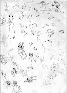
  The H pencil on Strathmore 500, 2-ply, 23" by 29" illustration board. Sounds a little technical but it is what I find works best for the technique of pen and ink, cross hatching. I'll talk more about pen and ink next time.


11/23/19...

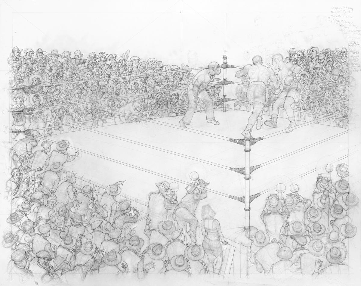
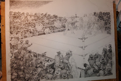
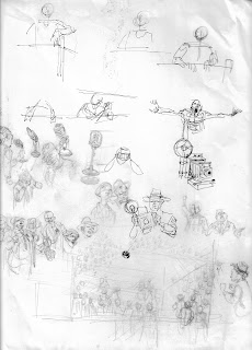
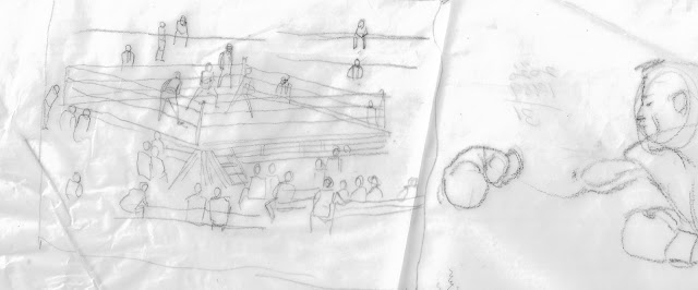
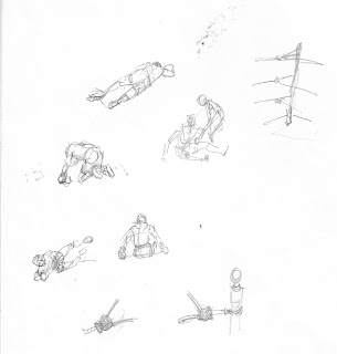
 The boxing ring size, angle and format is set (below). This would be the environment which the individual actors would perform. Sounds like I'm making a movie and in a way I am. Think about how important the layout/background is in anchoring the setting and giving the actors the proper setting to convey the story points. My thinking goes like this...in a quick sketch or  an illustration you are telling a story in a single sketch/drawing. In a movie (animated or live action) your story is told in a series of images run through a projector at 24 frames per second.

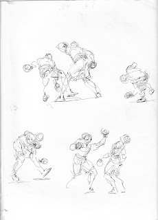
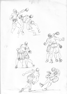
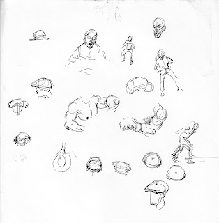
 My background in animation has me thinking not only about a strong, storytelling pose (extreme) but how the character got into the pose and how the character is going to get out of that pose. Thus, the character drawn has a feeling of movement, even in a stationary pose.

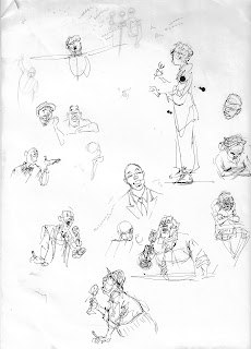
 Everything that describes that particular character is explained in that one drawing. Body language and facial expression must say it all about him or her at that moment in time. 


 12/21/19... 

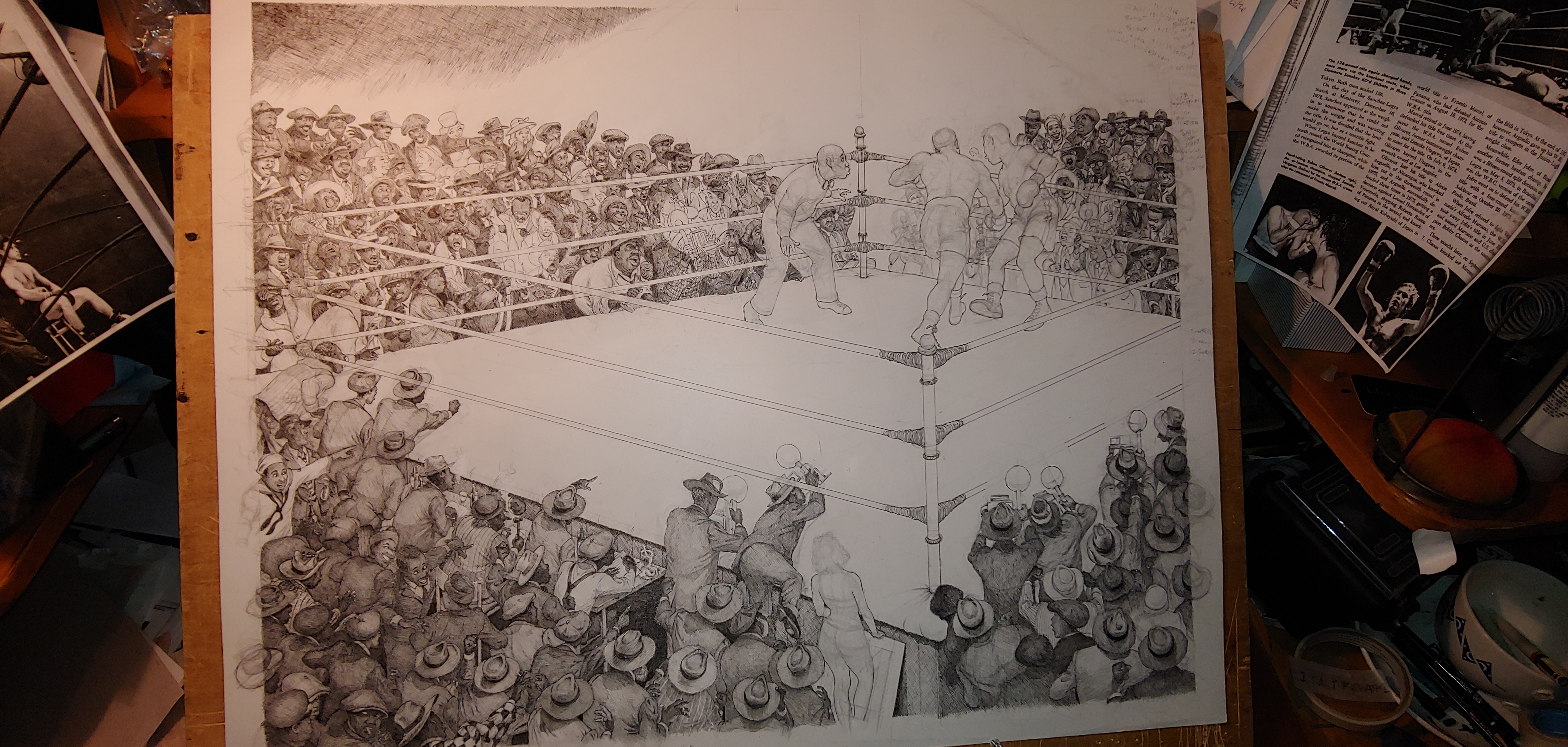
 First in importance is the placement of the ring posts (above). Foreground, left and far corner. To include the whole four corners of the ring I would have to draw the individuals smaller. What I wanted to say about each individual was not only in their body language but also in their faces. What was more important in telling this story, the ring or the size of the attendees? No contest.

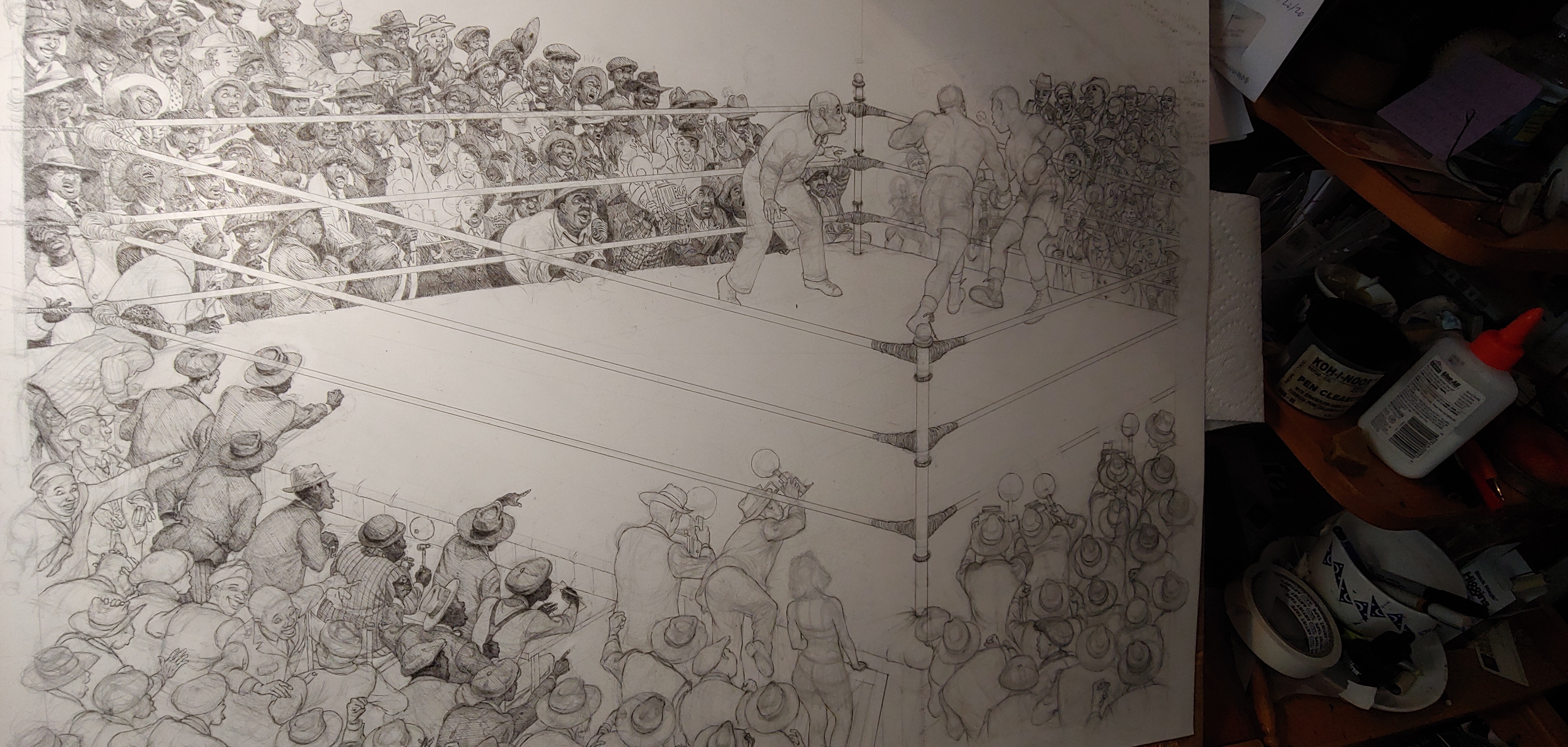
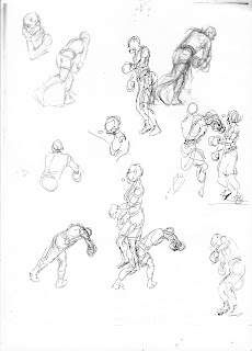
  Next was to position the catalyst of all the commotion, the boxers. Rather than drawing and re-working the main characters on the illustration board which meant much erasing and wearing down the surface of the paper, I worked it out on tracing paper...


12/16/19...

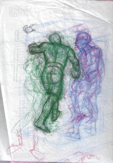
 then (below) penciled the images in.


.
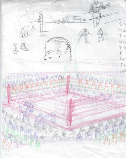
12/17/19....

 With the two main characters in place I begin to add the people. Beginning with the referee. The overall theme is to have all the people reacting to the knockout punch, the referee (below) is no exception as he recoils from the vicious blow. But as more people are added, the ref will help bring out another aspect of how this story is told.


 12/18/19...

 The people (right) were added in small groups around the boxing ring. This way I had a feel for perspective, proportion and scale from all angles.

 Everybody is engaged and doing something based on their mutual interest in the boxing match.

1/6/20...

 At the early stage keeping silhouettes was easy, making sure everyone stood out would be more challenging as the population (below) on paper increased. 


 1/19/20...

 There are a number of servicemen depicted. The excited sailor  (above, left) is my son-in-law Johann. He is presently active duty Navy (C.U. below) and helped me by researching navy uniforms of that era.


 As more people were added I wanted to convey the  feeling that everything was being motivated by this one act, the knockout punch. All eyes and bodies, for the most part, were focused in that direction.

 The referee (below) is not in the same body position he was in at the beginning. I saw an opportunity to get the referee to bend his body toward the action and further lead the eye into the action. From the beginning planning stages it was my intent to lead the eye toward the action by using the boxing ring pole nearest to the viewer. Follow the pole to the boxer's right foot, up to his body, through his right arm into the impact of the blow that ignites the emotions of the crowd. This will be further emphasized during the inking process.


 1/23/20...

All penciling done (below)  the illustration goes to the printer to get a scanned image at this stage.


Finally in part 3 I'll discuss the inking process.

Until next time...

Wednesday, March 23, 2022

Knockout 1930...an inside look Part 1 Preparation

 
Knockout 1930   23" X 29" pen and ink, partially finished on the drawing board)

In an attempt to be original I came up with 'an inside look'. I already had used 'anatomy of'' to describe how Circus 1930 came into being. In this latest pen and ink illustration, I'll take you on a similar journey with a few more insights into how I plan an illustration (an inside look) to make your read more interesting. 

 The initial idea was taking shape years ago based on quick sketches done while watching boxing matches on television. I have several ideas in mind. Over time one will surface. Something said, done, timing felt right, seen an image...some intangible will set the project in motion. Having laid down my base of quick sketches, I'm ready to start.
 Quick sketch pages from TV (below).


(Above, bottom pose, boxer on left used in illustration.)


 Research begins with watching 1930-40 movies on Turner Classic Movies (TCM), consulting the internet and book and magazines from that era.
 Black and white movies give insights on how scenes were planned out using light and shadows to highlight characters, backgrounds, clothing and anything that the director thought important or in some cases, unimportant. Keeping in mind this is not a black and white movie but black ink on white paper.
 The internet unearthed items still used today but designed differently (microphone) the ring/rope/ mattress and pole set up.
 Book and magazine photos gave me insights on how a photographers flash would cast an image on paper and how best could it be emulated. Clothing styles, body attitudes/language and how the subject was presented influence the illustration.
                                       
These thumbnail sketches are what I refer to as quick sketches with a purpose. I ask myself how would this look?, how would you hold a hand gun and what type would I use? Yes, there is a gun in all the action.
Men's jackets with lapels of all cuts and sizes and how would I depict the folds of fabric?
 I determined early on that hats and caps would be a major part in the storytelling of this piece. Each head covering would be as unique as the individual wearing it.


 More research through thumbnails for cameras and how they were held, boxing shoes, a stool and possible body attitudes, faces, grouping and from what corner of the ring would be the best way to show the announcer?
  All these questions and more are worked out and answered through thumbnails. (below).


 What will be the strongest angle to showcase this illustration? (below) 
The angle of the ring is worked out early  as this will set the stage for the whole presentation. How close to the ring do I want to be? Will this work with seeing  half the people from behind?  Thumbnails will help me determine.


The knockout punch.
 I had wanted to show how people react emotionally to this most violent of sporting events. Boxing is as close to a Roman gladiator, kill or be killed spectacle, as civilized humans can get. Deaths have occurred over the years to these modern day gladiators.


Early  ideas on how to best show the victim of the knockout punch.


 These thumbnails (below) gave me insight as to how this story was to be told.
I wanted to show on the faces and body language of the attendees what had just, in that moment, transpired in the ring.
 I wanted the knockout victim to be unconscious before he lands on the canvas. 
These thumbnails  (below) found that moment for me.


 This is the image I would build the illustration around (below). This photo of the Ali-Frazier fight (right) was the pose I wanted for the boxer on the left. Not to just copy the pose but to make adjustments for a better silhouette.  A stronger silhouette was achieved by separating the right arm and straightening it out showing the trajectory of the punch. Lifting the left arm away from the body, again for a better silhouette . Adjusting the left foot and leg forward, again seeking a stronger silhouette.


Once  the ring size and angle were determined, I fleshed out the key figures on tracing paper (below).


To be continued...


Friday, March 11, 2022

Steamboat has legs!


(Interior page from Steamboat School)


Anything that continues to garner interest, it is said to 'have legs'.

Steamboat School is in that category of having legs. I first blogged about the book on it's publication and release on June 6, 2016. Since then in this blog I have updated awards and recognition it has received on eight more occasions ( Aug. 29, 2016; Oct. 17, 2016; Dec. 14, 2016; Dec. 16, 2016; Jan. 25, 2017; Feb. 2, 2017; Oct. 20, 2017; Oct. 31, 2017).

This is the latest installment of Steamboat's legs.

  Mar. 3, 2022 I was informed Steamboat School had been chosen to be included on the grades 3-4 Great Texas Mosquito List 2021-22 school year by the Brazosport Independent School District. Being on the list makes Steamboat School a contender for the Great Texas Mosquito List Student Choice Award to be announced in April of this year.

Also in regards to Steamboat School.

 PBS in collaboration with Ozarks public television made a documentary Missouri! A Bicentennial Celebration 1821-2021 presented by Missouri State University.

In the hour and 54 minute presentation, a section of the documentary discusses education in Missouri prior to the civil war as it pertained to Black Americans. The artwork from the pages of Steamboat School give visuals to the words explaining the circumstances of John Berry Meachum educating African-American children from a floating school house in the Mississippi River after a law was passed forbidding African American education in Missouri.

Though this story is well known in Missouri, only one picture of John Berry Meachum exists (below).   

(John Berry Meachum)

(The documentary can be viewed on line by typing in> Missouri! A Bicentennial Celebration 1821-2021)

Until next time...